Hands-on Approach
When I met the founders of KENNEL — an architect, a film maker and a creative entrepreneur, there was something really special about it right away.
There are certain projects that stay with you. Not necessarily because they are grand or of a high-budget, but because something about them resonates — the unusual ask of the creative brief, the mindsets of the founders, or simply the way everything comes together.
KENNEL is one of those.
Hands on approach
At first glance, the lush greenery of Dempsey Hill and its charming military barracks seem an unlikely location for a co-working space.
Yet here, space and place come together naturally — close enough to the city, but tucked away in a quieter setting for creative founders to create, connect and grow.
The creative brief was to craft an identity that feels hand-drawn, artistic, and authentic. It had to express the spirit of the space and its community—the "Kennelists."
My instinct turned immediately to printmaking, my major at art school. There’s something beautiful about the printmaking process.
The artist can never control every aspect of the craft. It creates a gap in control, where what happens within that space can turn out to be surprisingly imperfect, authentic and human. That's precisely why I chose silkscreen for Kennel- it carries the character of an artist’s hand at work.
Why a Dodo?
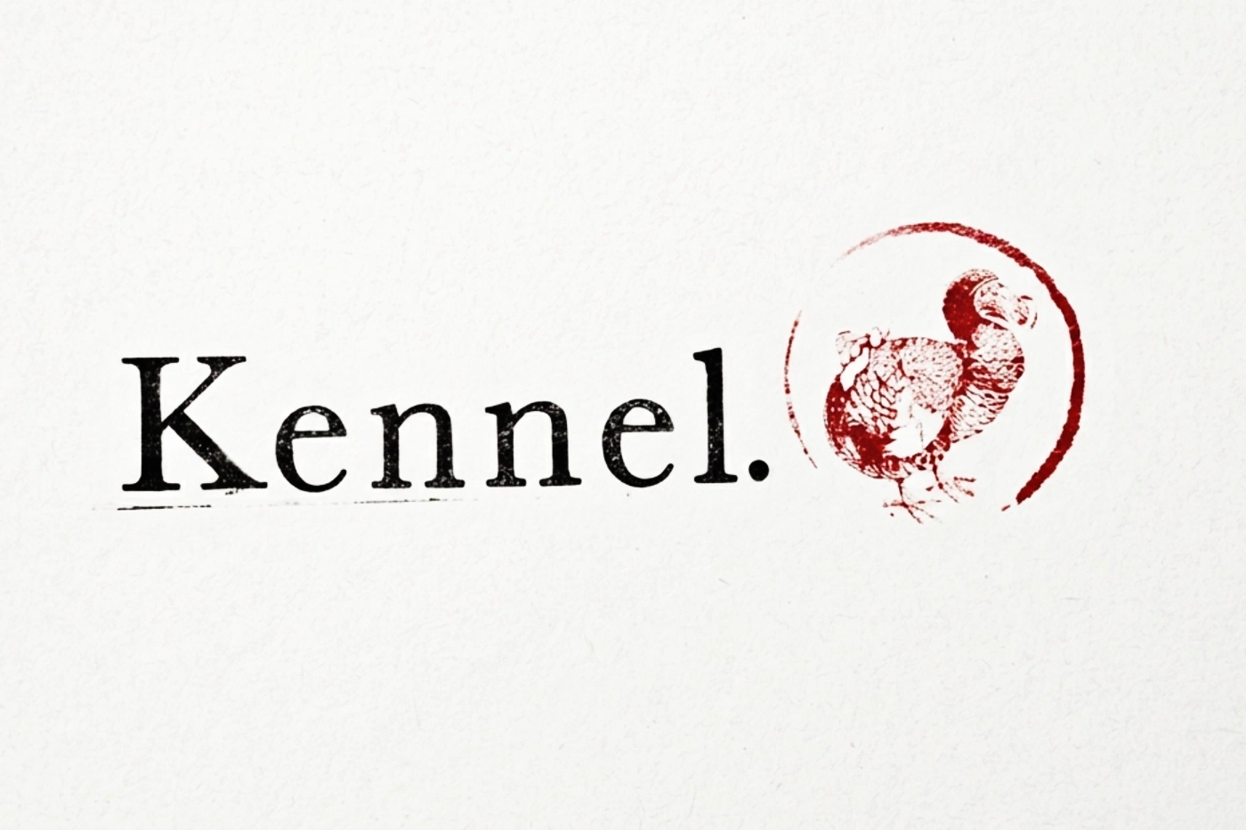
The dodo is an odd-looking, extinct bird. Many artists have attempted to capture what dodo might have looked like through illustrations found in historical journals.
This appeals to me as a brand mark for KENNEL: a symbol of curiosity, evolution of an idea and stories from memory. The expressive line drawings.
The execution
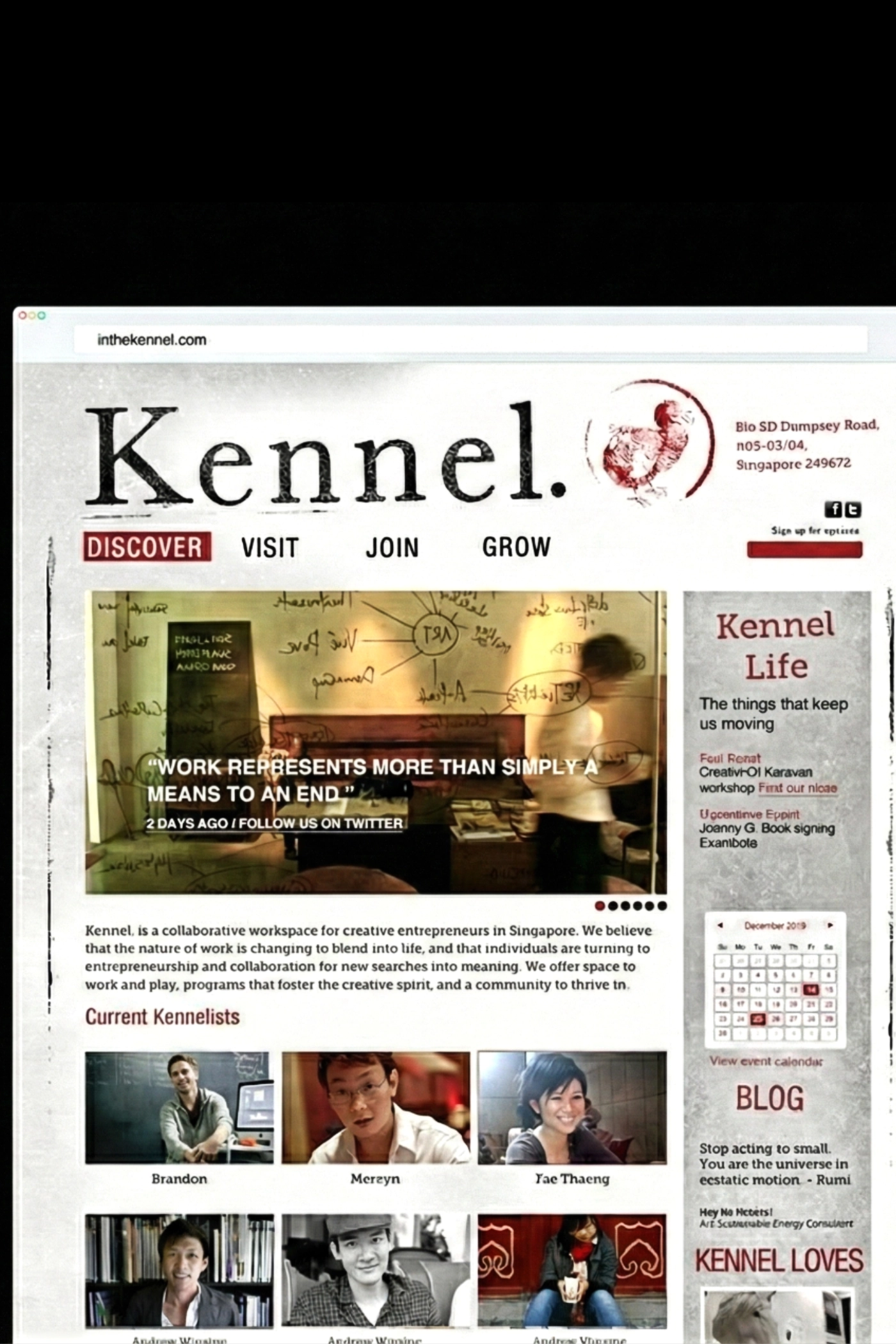
Simple, gestural black-and-white drawings of Dempsey’s lush greenery anchored the WordPress site. I wanted the line drawing to spark a sense of curiosity about exploring Kennel.
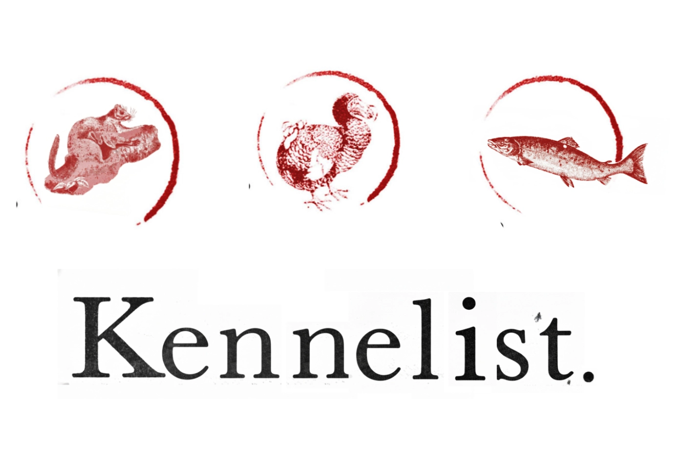
The identity was then silkscreened by hand. The dodo logo was silkscreened by hand. The name cards were rubber-stamped, with their backs left blank for handwritten messages.
Fast forward a few years
Years later, while presenting my portfolio for an Art Director role, a Creative Director paused. "I recognise that," she said—the name card, the website, the space. She'd been a Kennelist. The conversation became an opportunity.